
You are here
Visualizations
Our visualization research for this project is primarily focused on two primary topics: how to communicate the information being collected during a response event, and the current status of the project, to the general public, and how to best orient and collate all of the available data sources into a form that allows an operator to make an effective and data-driven assessment of objects discovered during response operations.
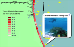 Infographics: Our infographics are designed to let you examine the data that we're collecting as part of our Super Storm Sandy research in a more intuitive way. You can interact with the data, find out what we're doing in your area, and what information we have available to help you understand the current state of the Super Storm Sandy response. They also try to show you how we deal with the data here at CCOM so you can understand what we're trying to do with our research.
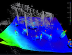 Orientation Selection: One of the most difficult things to deal with when you're working with sonar and lidar data is to find the right way to look at your data: a lot of time is spent just looking at data and trying to work out what it shows so that we know what to do with it. Is that a bit of a house? Or is it a rock that's been there for a long time? Have a look at the version of the tools that we're building to help us here and see if they work for you!
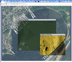 Web Lens: Comparing two different datasets for the same area can be difficult. If you overlay them, one is obscured. If you put them side by side you have to track the same location in each image through optical landmarks. There are more specialized methods, but one simple option we're looking at is a 'Lens' where you can see an adjustable part of one image in the context of one or more others.


