
You are here
Data Visualization Research
To inform the public about the scope and importance of post-Sandy cleanup efforts, we are creating an array of interactive infographics. Such infographics are a popular method of conveying complex information to general audiences. They engage users with interactivity, allowing them to explore the data within carefully constructed constraints. This type of format is easily consumable and more likely to be "shared" by members of the public via social media than traditional documents. 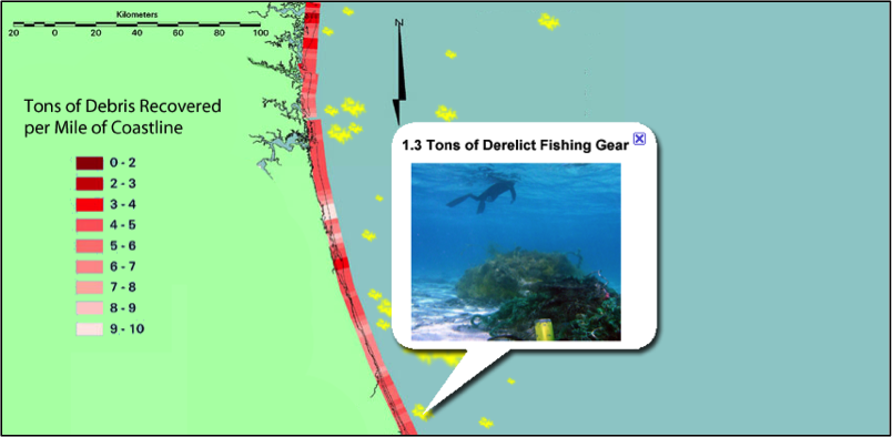 An example would be an interactive map of the Atlantic coastline, which users could navigate and zoom in on to see their area-of-interest (a mockup of such an infographic is show, right). Following along the coastline would be an indicator showing the amount of debris recovered offshore from each section. Significant debris fields and other areas with concentrated cleanup efforts would be highlighted offshore. By selecting these areas the user could bring up detailed information including photos and descriptions of the recovered debris. (e.g., "15 vehicles were discovered to have been deposited in this spot"). Examples of these interactive products being used to share project results and engage the public can be found in the U.S. Census Bureau’s Data Visualization Gallery.
Due to the extent of the data being collected and processed in response to the effects of Super Storm Sandy, automated target recognition will play the most significant role in detecting and identifying marine debris. However, even with the best algorithms, there will always be ambiguous cases that require human evaluation. Even if these represent only a small fraction of potential debris, the overwhelming number of them requires a streamlined approach to evaluation. Current methods (in conventional data processing software) present a view of the data to the analyst, who must then navigate and reposition their viewpoint to inspect the candidate from various angles. We are investigating the potential benefits of creating a system which automatically generates a collection of multiple views for each candidate, based on metrics determining which combinations of data sources (MBES, aerial imagery, backscatter, etc.) and angles/presentations are most likely to help the viewer discriminate natural from artificial features. Our interface will present these views simultaneously to the analyst, who will be able to quickly scan over them, select an evaluation, and proceed automatically to the next target.
This research has benefits beyond just identifying marine debris. It may also help improve the efficiency of the time-intensive task of sonar data processing. A significant portion of the data inspection time is repositioning views of the data such that outliers can be identified and remediated. By automatically determining which views are most likely to highlight these outliers, and presenting these views in a streamlined workflow, the time required between data collection and creation of a usable product could be considerably reduced.
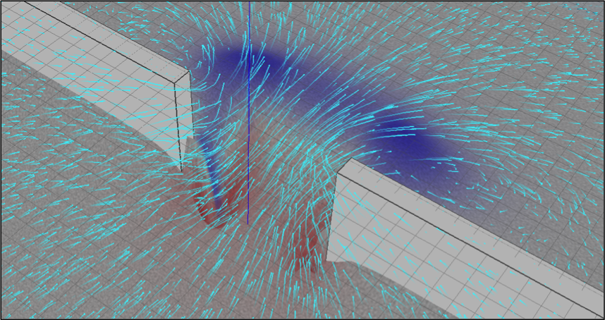 As part of our ongoing CCOM efforts towards producing visualizations that compellingly convey the contents of complex marine datasets in an intuitive manner, we have developed a suite of 4D visual analysis tools, the most recent of which is shown on the right. Here we present the models produced by sediment transport simulations. The software presents 3D animations that depict the flow vectors throughout the water column, the dynamic changes to the bathymetry, and the movement of sediment particles from areas of erosion to areas of deposition. This work is aimed at evaluation of marine engineering designs, e.g., pilings to support offshore wind farms, and the study of extreme weather events on coastal features.
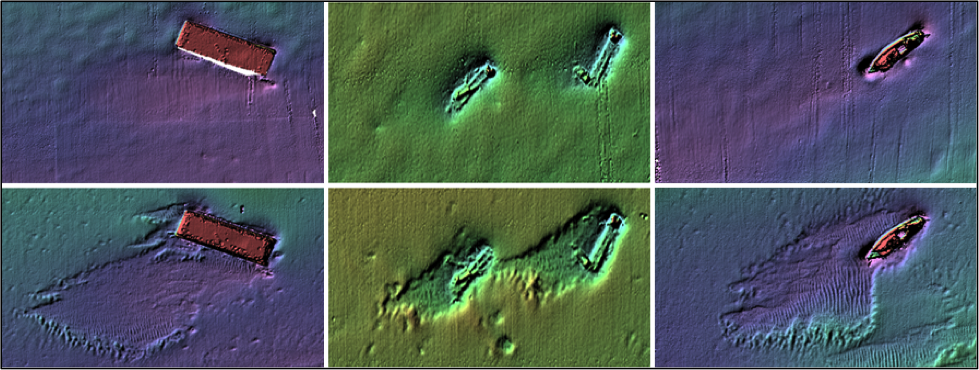 As a test case, we are focusing on the Redbird artificial reef site off the coast of Delaware Bay (left: top row before, bottom row after Super Storm Sandy). The site features a large collection of intentionally sunk debris, which reacted to Super Storm Sandy causing intriguing changes to the seafloor in the area, as revealed by extensive pre- and post-storm surveys. Through our study of what has happened there we hope to learn more about the dynamic processes involved, as well as strengthen our sediment transport simulations through comparison of hindcasts with observed changes. We are leveraging this research to address our objectives of understanding climate change with respect to the effects of increased storm severity on marine environments and how society can plan and respond to them through better informed engineering of coastal structures.


